


enfant terrible
Client: enfant terrible GmbH
Project: Corporate Identity
Web: enfant terrible
Typedesign: Marc Rudin
Awards: Brand New Awards 2013
Details
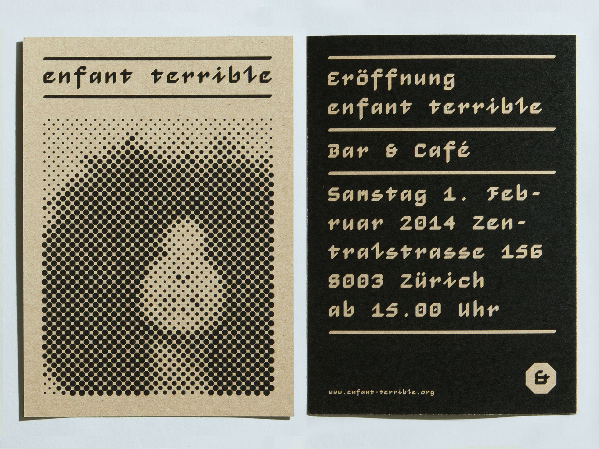
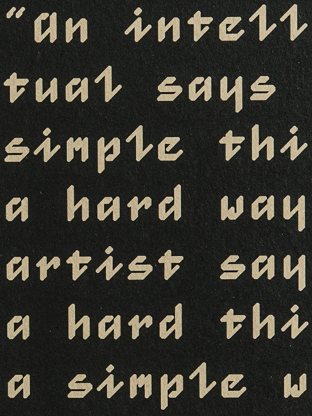
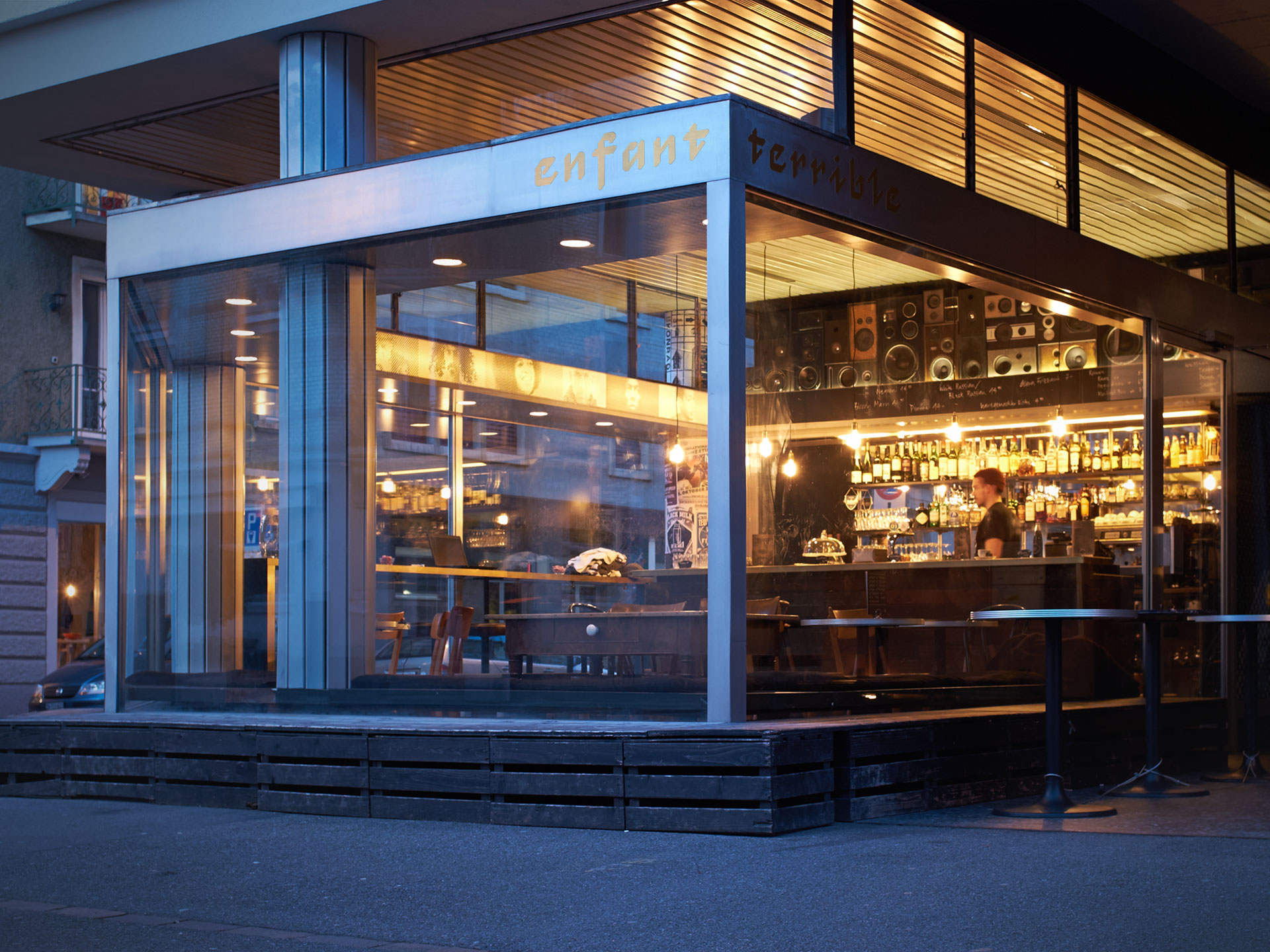
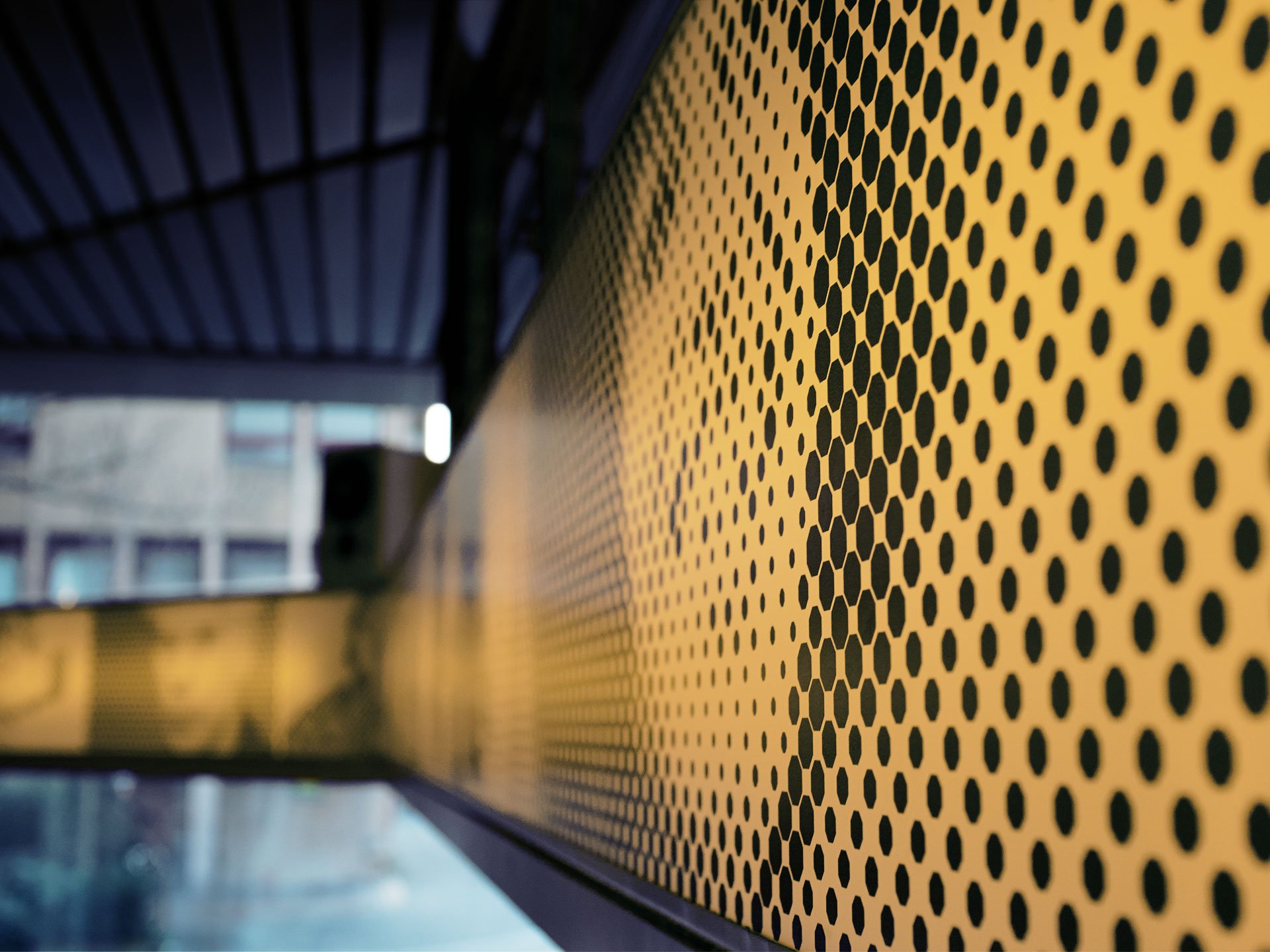
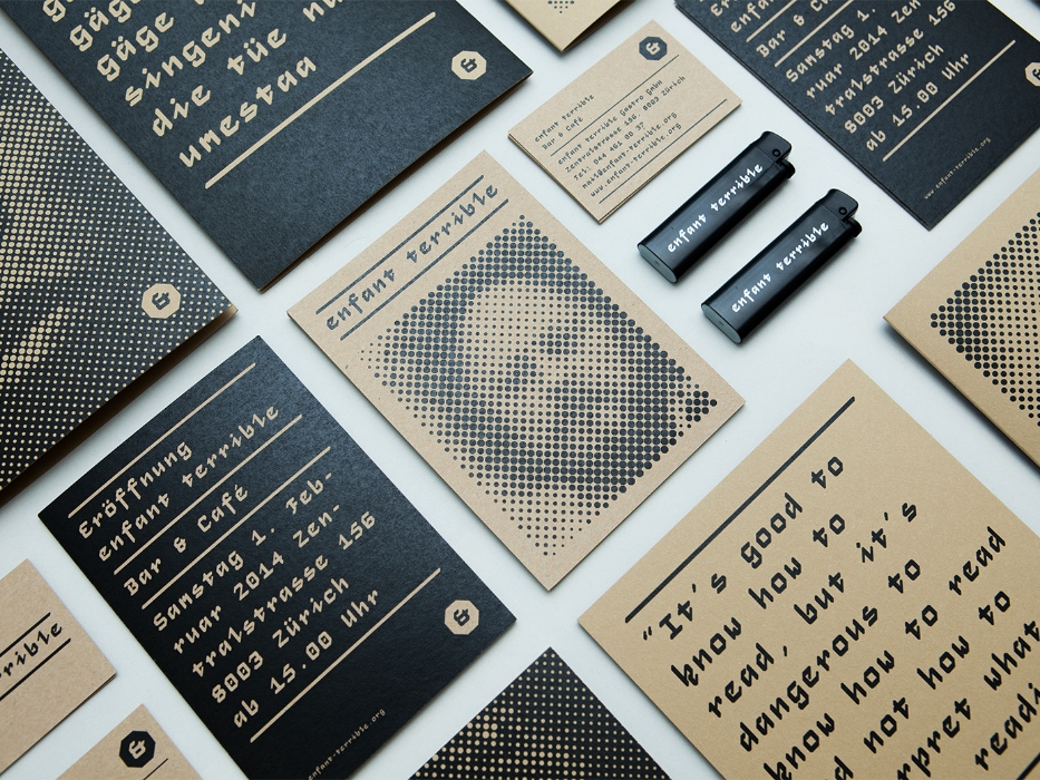
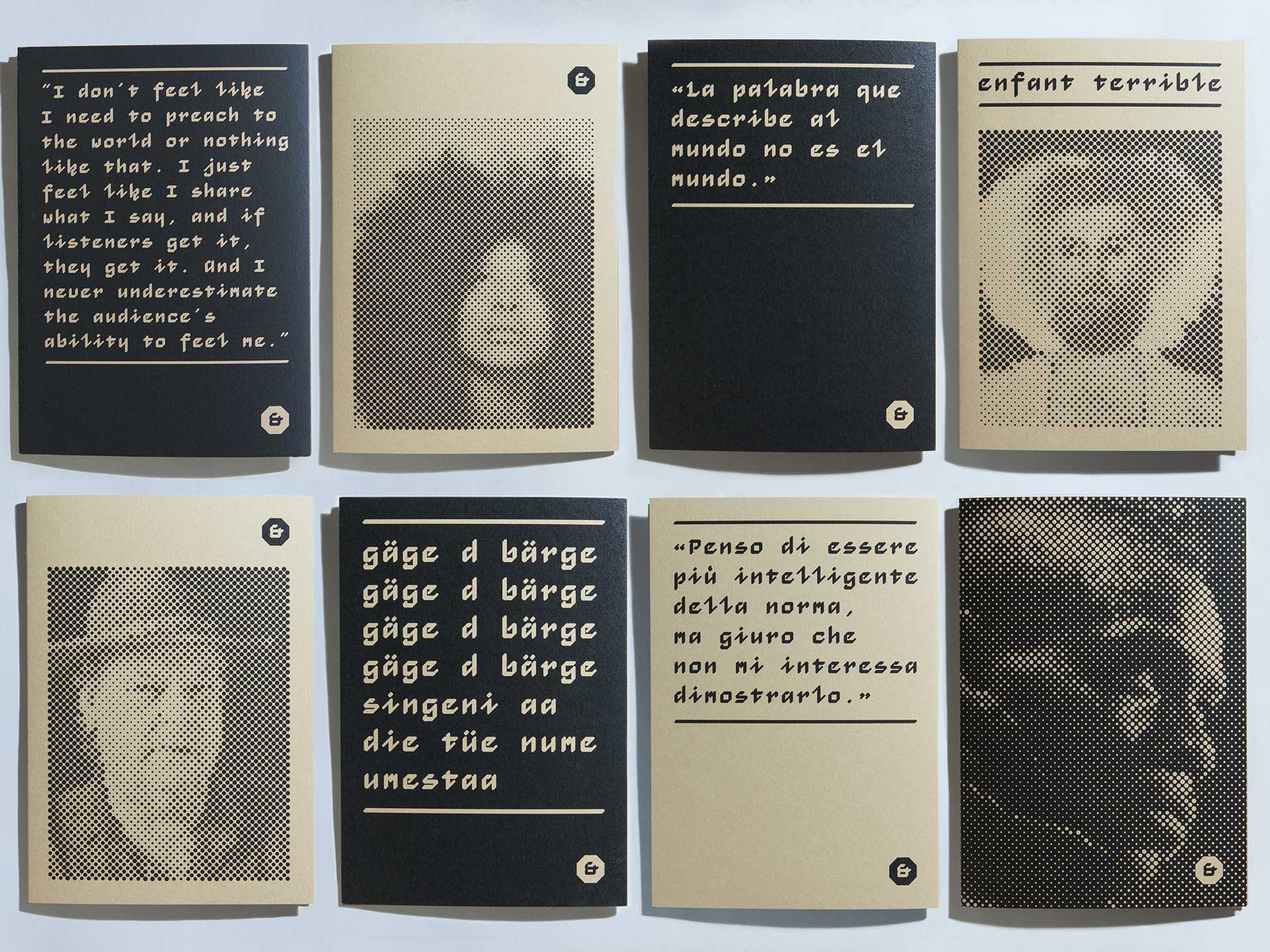
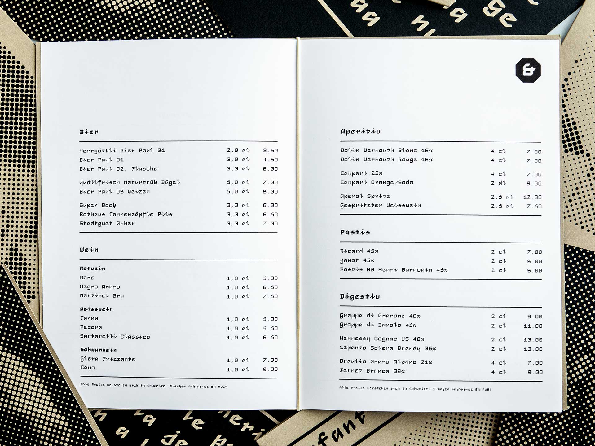
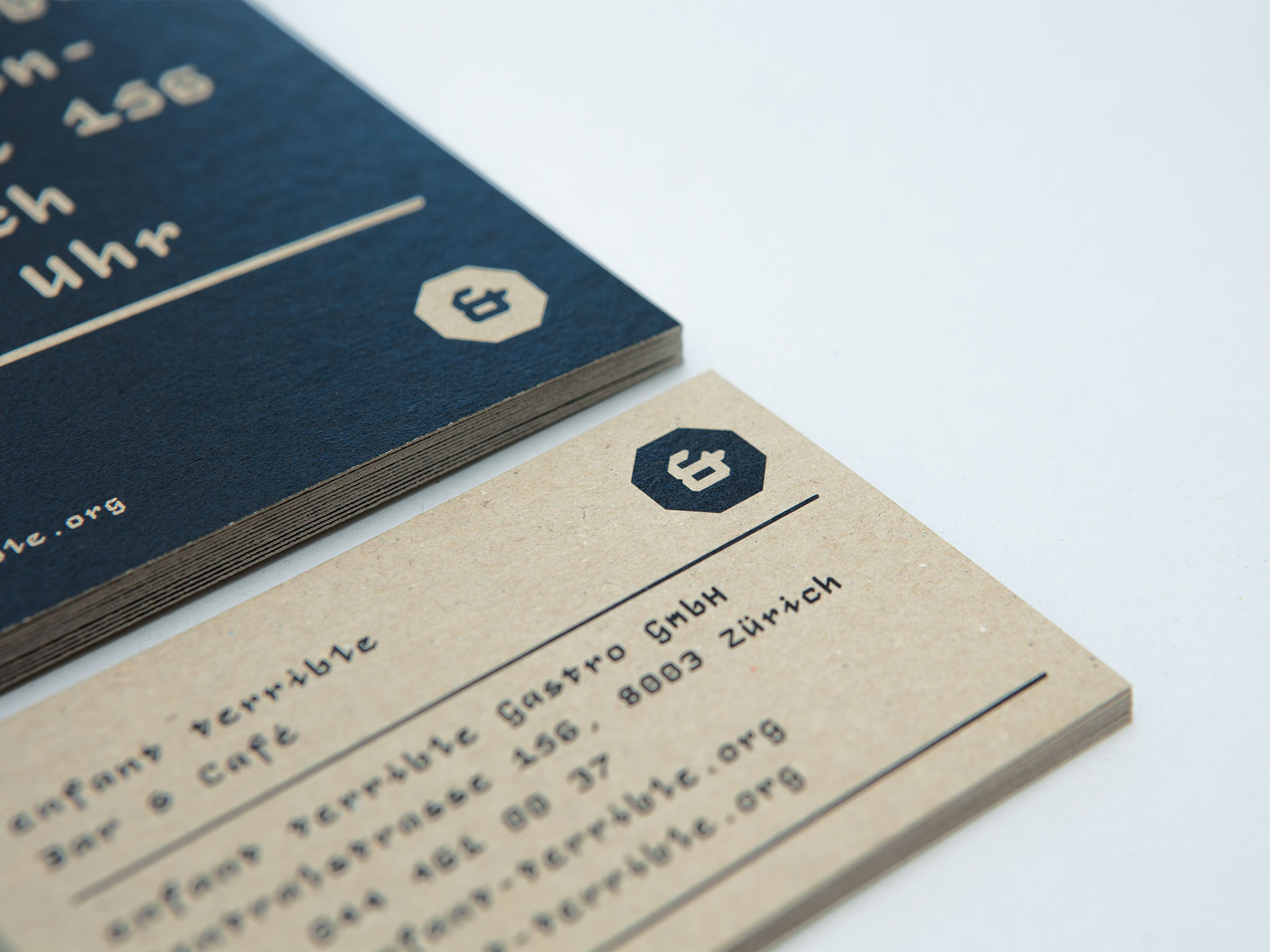
enfant terrible, Bar & Café, ist ein Lokal in Zürich mit Fokus auf Jazz- und HipHop-Musik. Das visuelle Konzept basiert auf einem Achteck als Grundform, da die Form optimal zur Architektur passt, die ebenfalls Elemente mit 45°-Winkel vorweist. Die geometrische Schrift Monocto ist eine aufrechte Kursive und wurde vom Typedesigner Marc Rudin entwickelt und für dieses Projekt überarbeitet. Die Schrift bezieht sich historisch stark auf eine Kurrentschrift. Der Abdruck des Schreibwerkzeugs wird aus einem Octagon hergeleitet. Auch die Bilder sind generiert durch einen Raster aus Achtecken. Die abgebildeten Personen sind «enfant terribles» die die Gründer der Bar inspiriert haben. Aus diesem Grund wurden Zitate von den jeweiligen Persönlichkeiten verwendet. Das Monogramm symbolisiert das Et-Zeichen (&) aus «Bar & Café» und gleichzeitig die Abkürzung von «enfant terrible».
Enfant terrible is a bar and cafe in Zurich with a focus on jazz and hip-hop music. The visual concept is based on the shape of an octagon, which derives from the architecture of the bar room with its 45-degree angled floorplan. The geometric font Monocto is an upright italic which was developed by the type designer Marc Rudin and revised for this project. On one hand, the design is inspired by a historical running hand written with a pen angle of 45°, and on the other, by rational, utilitarian monospace types. Also the abstracted images were rasterized with an octagonal pattern. The images show people, all “enfant terribles”, that inspired the clients during their lifes. Additionally quotes of these persons were used in the project. The monogram symbolizes at the same time the Et-sign (&) from “Bar & Cafe” and the first letters of “Enfant Terrible”.